St. Louis Language Immersion School
Services - Branding
Judges Pick - AIGA Design Show 2023
Gold Winner - 20th Annual Service Industry Advertising (SIA) Awards
Honorable Mention - MarCom Awards 2022
2022 Graphic Design USA American Graphic Design award
At the St. Louis Language Immersion School, kids get an incredible education in English and three target languages: French, Spanish, or Chinese. Starting from kindergarten, they can graduate as fully bilingual students. And the best part? It's a public charter school, welcoming all St. Louis City students, offering a culturally responsive and transformational education that can truly enrich their lives.
Despite this unique curriculum and educational experience, most St. Louisans had no idea the school existed.
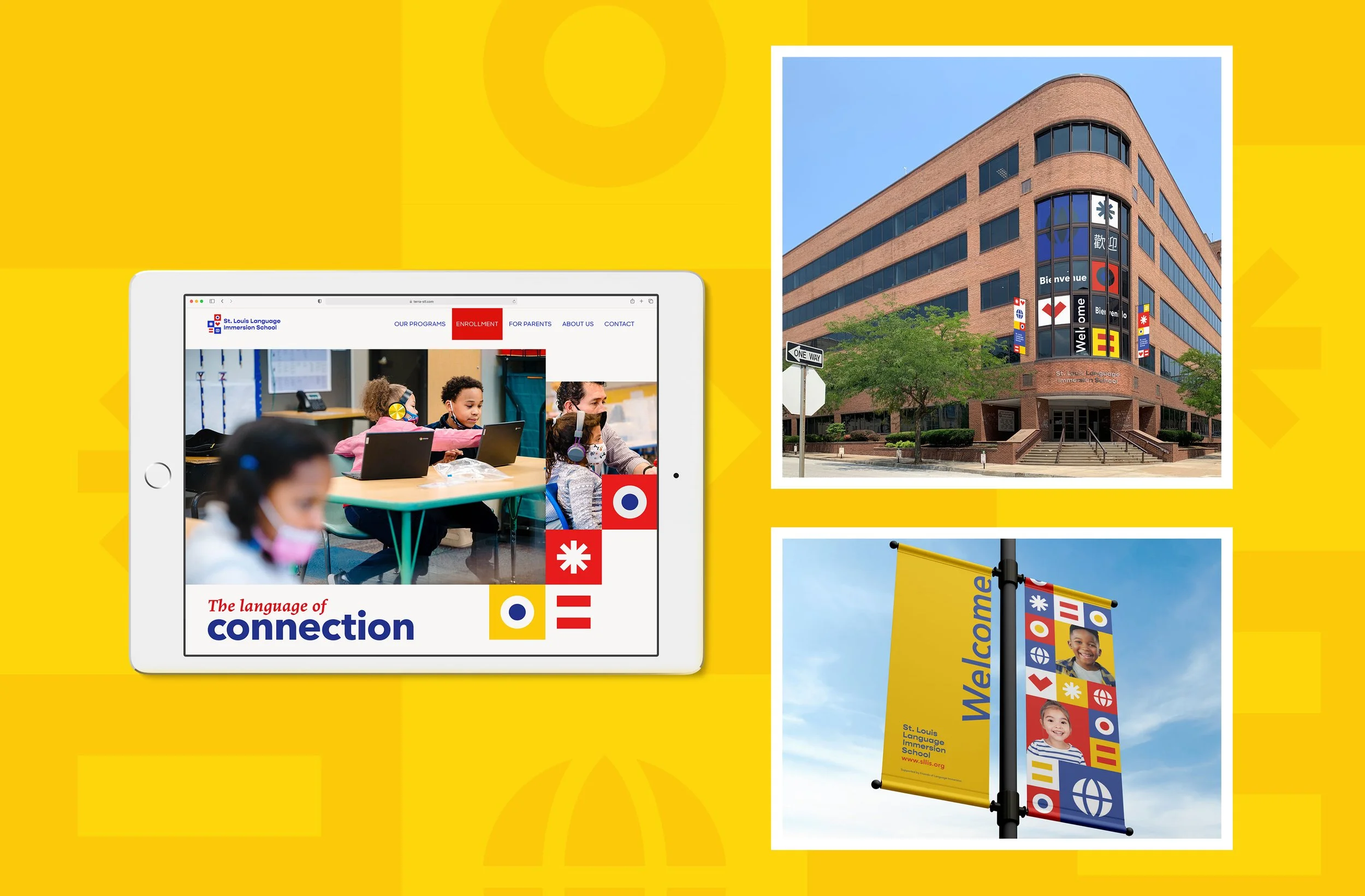
The school had taken a hard look at themselves, assessing their strengths and weaknesses, and went through a strategic planning process. They also purchased and moved to a new school building, consolidating all three language programs together under one roof, with a shared vision of unity. With the lessons from their strategic planning process and a big move under their belt, they came to Atomicdust to help them update their branding and messaging to reflect the exciting new chapter of the school’s history.

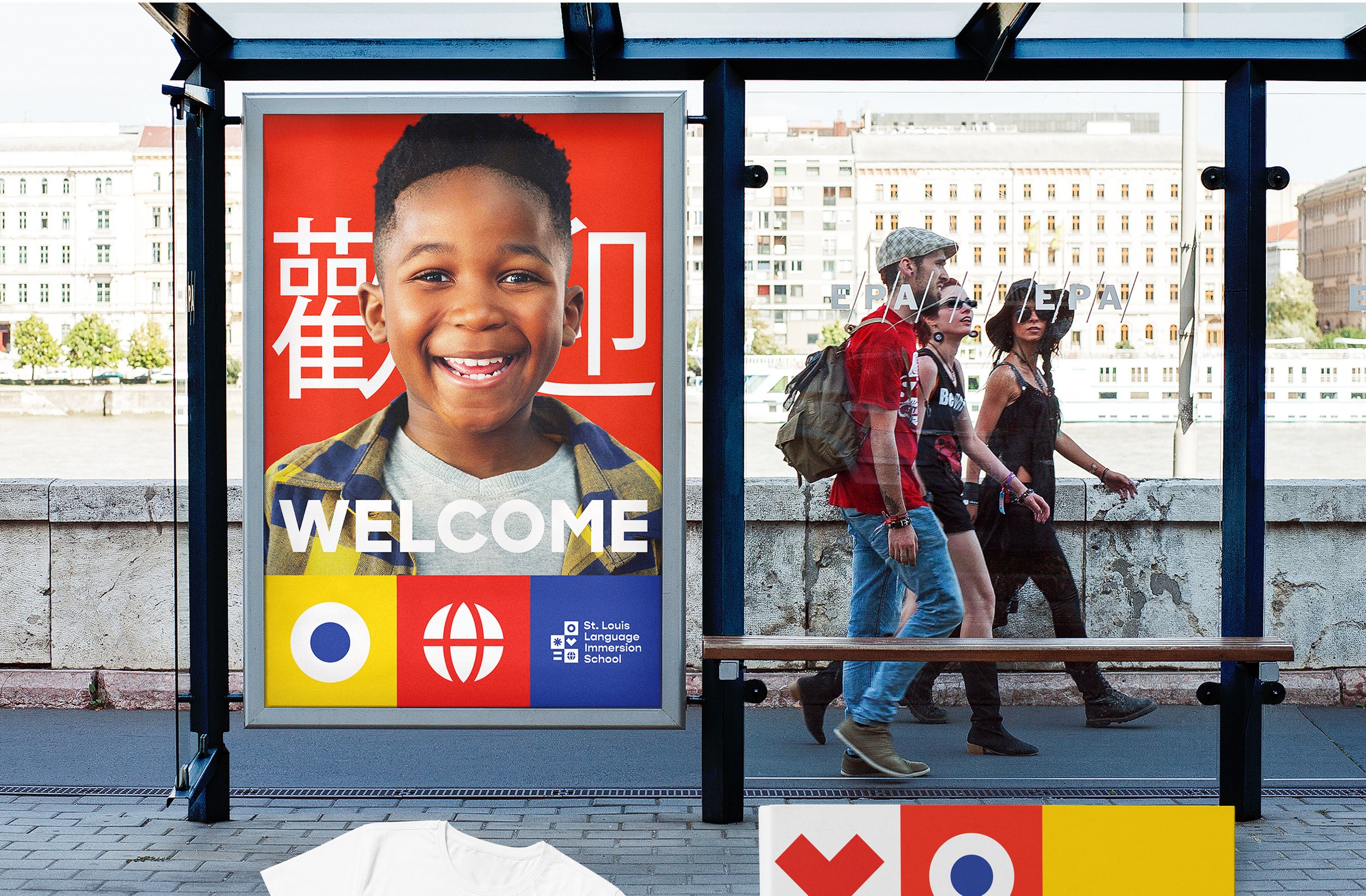
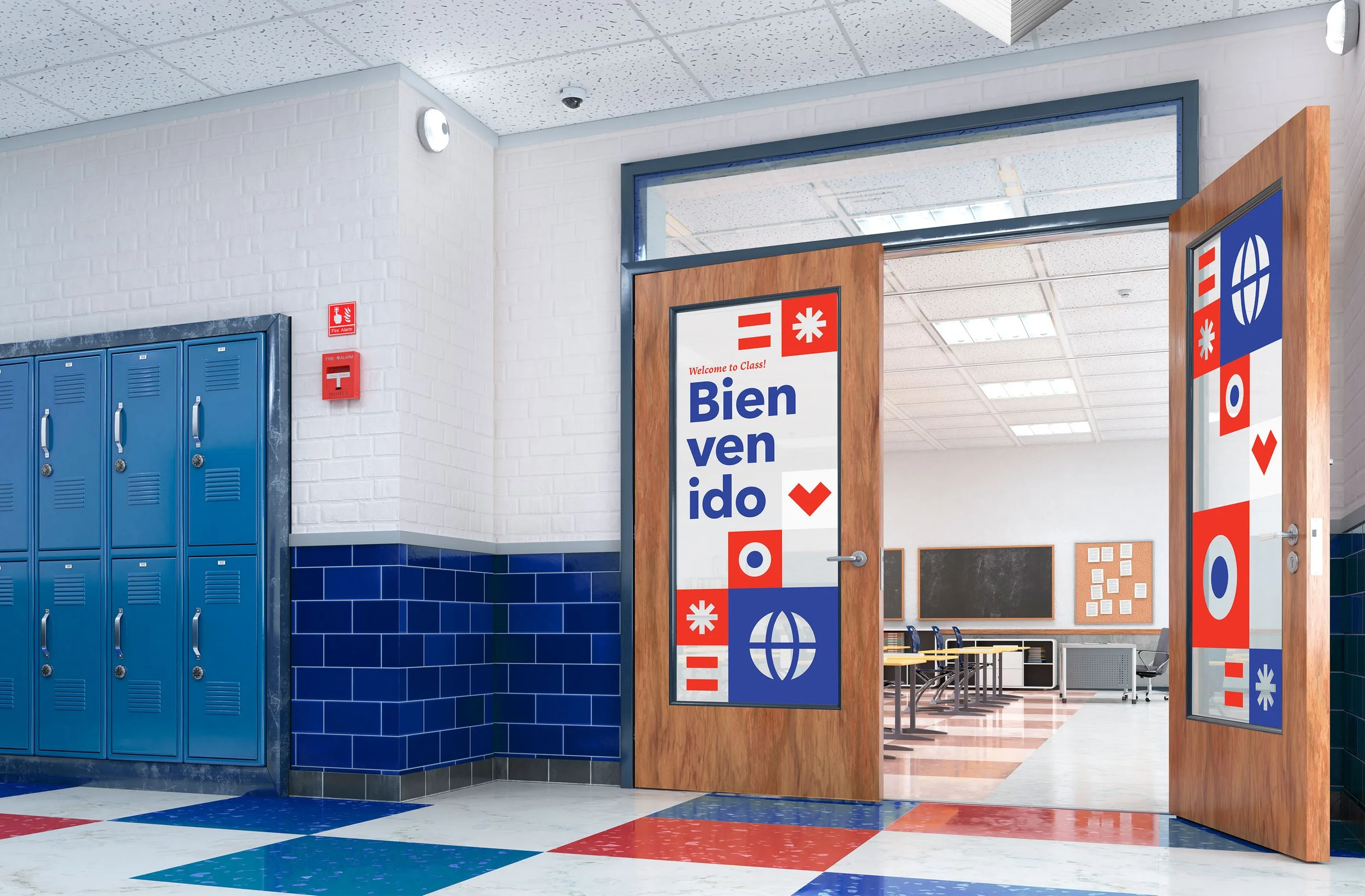
A bold brand of their own.
Language can be incredibly visual. I was inspired by that idea and developed a brand identity that expressed that. The geometric forms of diacritical marks that tell readers how to pronounce words (umlauts, accents, and other dots and squiggles) served as my inspiration. I created a visual language representing words from the school’s mission statement. Color inspiration was derived from the Spanish, French, Chinese and St. Louis City flags—a nod to the languages taught at the school and their downtown St. Louis location.
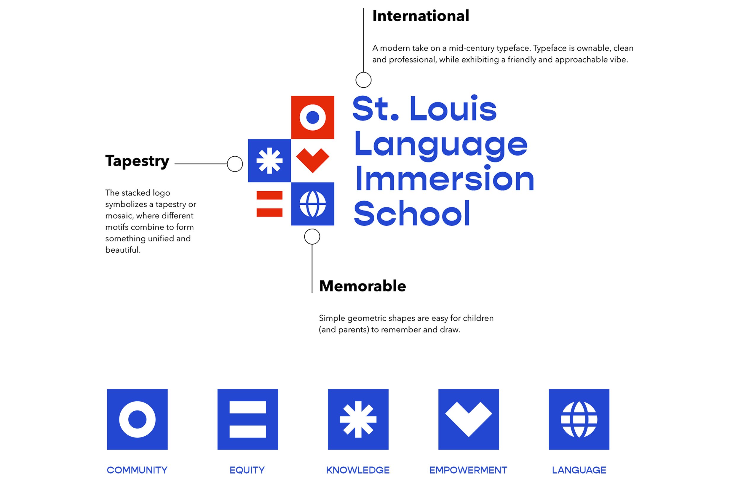
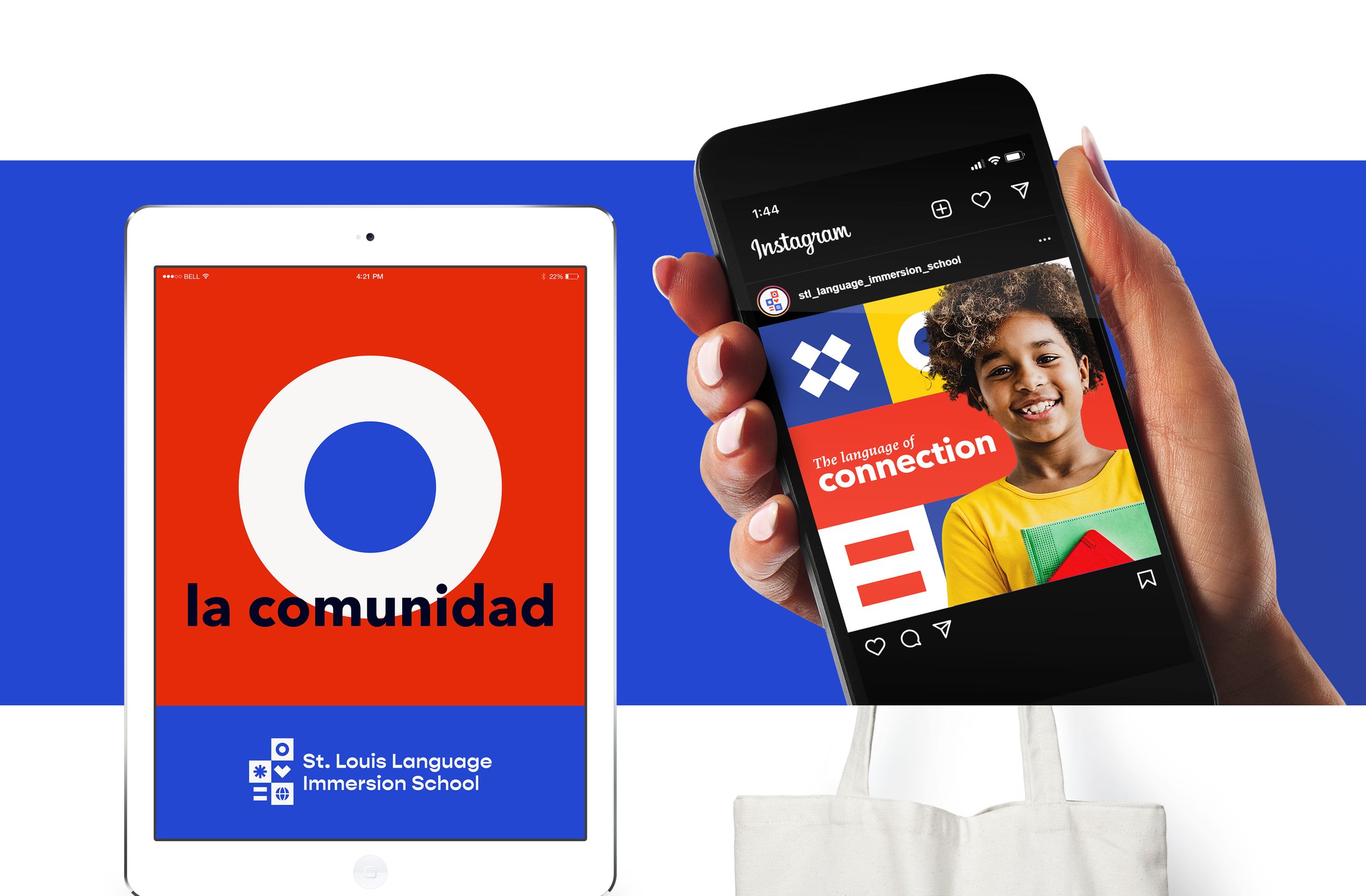
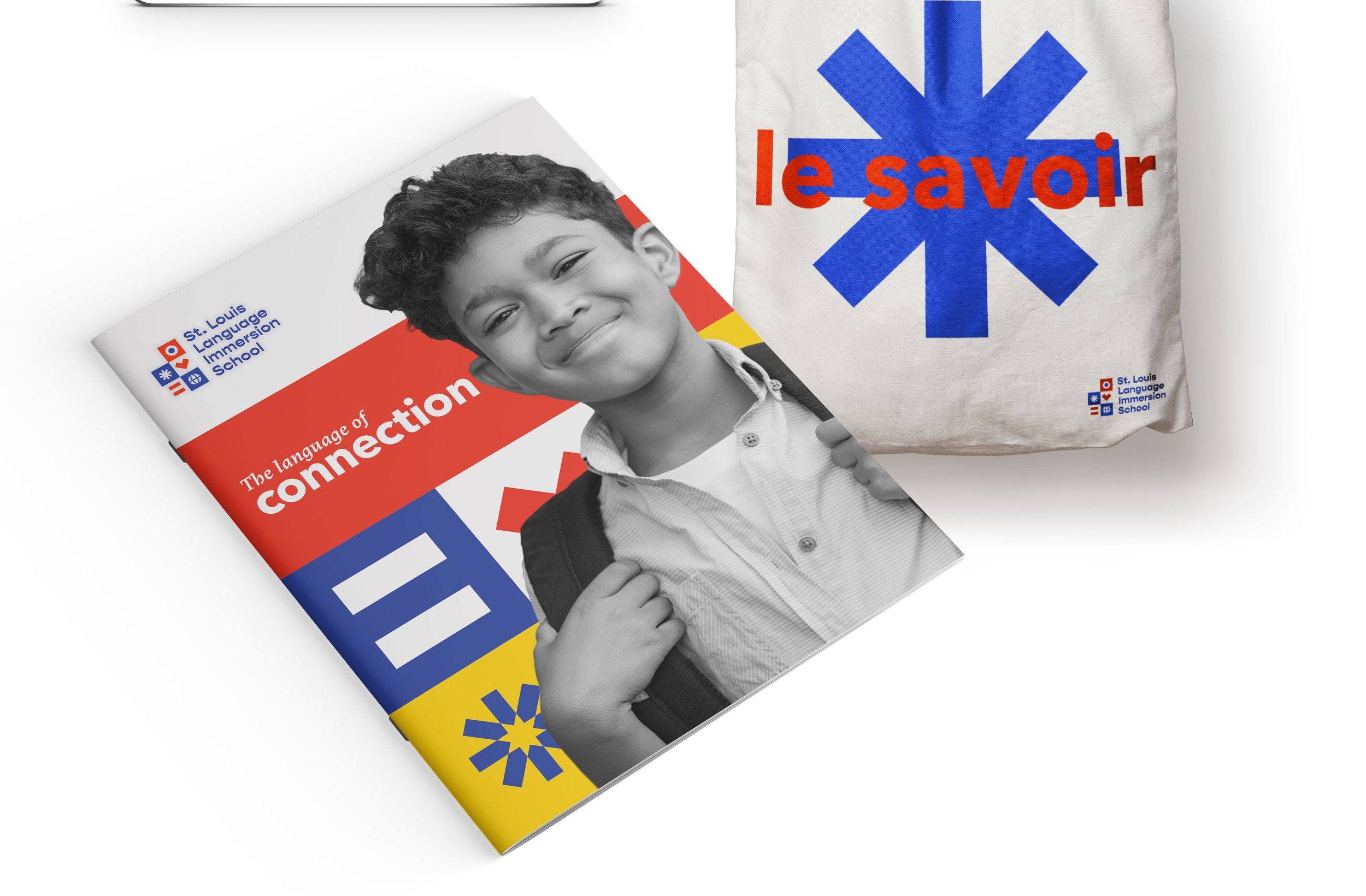
A colorful mosaic of community.
As the collection of symbols evolved, I envisioned the blocks coming together like a beautiful mosaic, each piece representing the diverse cultures and languages that converge within the walls of the school. Together, these brand elements radiate the warmth, vibrancy, and the boundless possibilities that the St. Louis Language Immersion School embodies.

A visual language that speaks volumes.
Working with St. Louis Language Immersion School to refresh their brand was a truly rewarding experience, and allowed Atomicdust and I to showcase the immense value the school brings to St. Louis.