Dan Brassil
Services - Branding
St. Louis realtor Dan Brassil contacted me because he needed help creating a visual identity that reflected his mission and values and also differentiated him from other realtors in the area.
While the real estate process seems straightforward, it can often be a confusing and frustrating journey. I wanted to play off of this idea and showcase Dan’s ability to make sense of the home buying & selling process.
The winding path that forms the letter “B” in Dan’s logo illustrates the twists and turns involved in the home buying and selling process. Upon closer inspection, a capital “D” and a lower case “b” have been incorporated into the mark, a nod to how Dan Brassil is ever present during this complex process, ensuring the success of his clients.


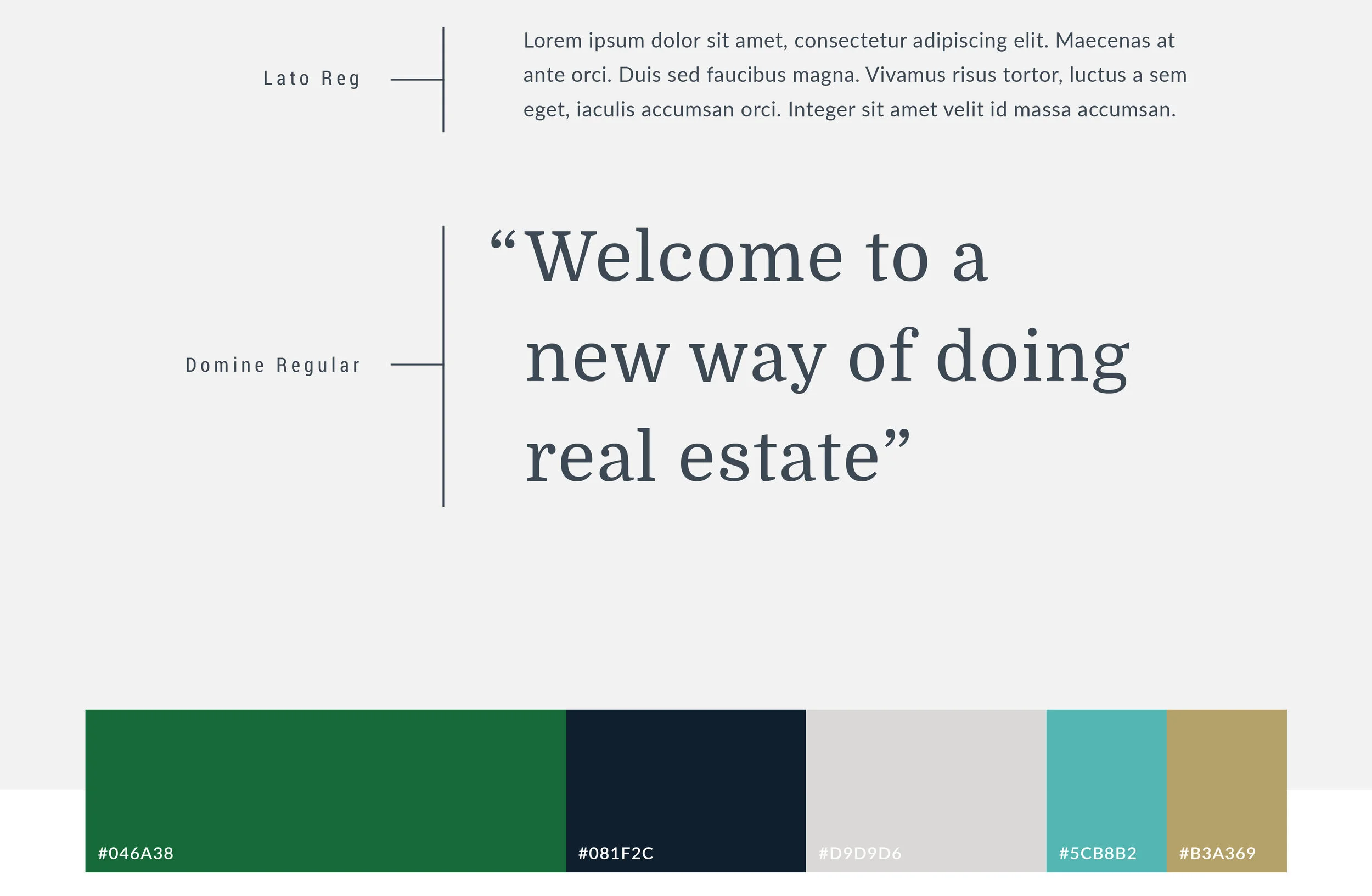
Standing out from the pack.
Dan has a great sense of design and his clients skew towards hip buyers and sellers in St. Louis’ historic, trendy neighborhoods. With this in mind, I created a clean and sophisticated visual identity that reflects Dan’s personal aesthetic and appeals to his target market.
Inspired by the circuitous journey of real estate, and Dan’s ability to make sense of the process, I developed a fresh identity system that is meaningful to Dan, appeals to his audience and differentiates him from other realtors in the St. Louis region.


“One of the reasons I was so pleased with what Alex produced was that he listened to what I wanted and created a story around the logo that delivers a visual message as well as a talking point between myself and clients.”
— Dan Brassil