City Foundry STL
Services - Branding, Environment, Signage
City Foundry STL (CFSTL) is the adaptive reuse of the 15-acre former Federal-Mogul Complex located in Midtown St. Louis. The complex has been transformed from an abandoned, urban industrial site into a 21st century mixed use development that celebrates creative concepts in food, commerce and entrepreneurship. Through my role at Lawrence Group, the development’s designer and developer, I have been deeply involved with the project and a part of the project team since CFSTL’s inception.
I was tasked with creating a brand for City Foundry STL that communicated the mission and values of the project: to be a hub of creativity and innovation in all forms.
After talking with key stakeholders, I developed the following goals for the CFSTL brand 1) demonstrate a love of St. Louis 2) demonstrate that CFSTL is a force for creative and innovative thinking and finally 3) be a reflection of the community the site is a part of.
I wanted to respect the industrial heritage of the site; however, it was important that the CFSTL brand was more about the future than the past. I wanted CFSTL to be about what’s next, not what’s happened.


A modern brand for a historic icon.
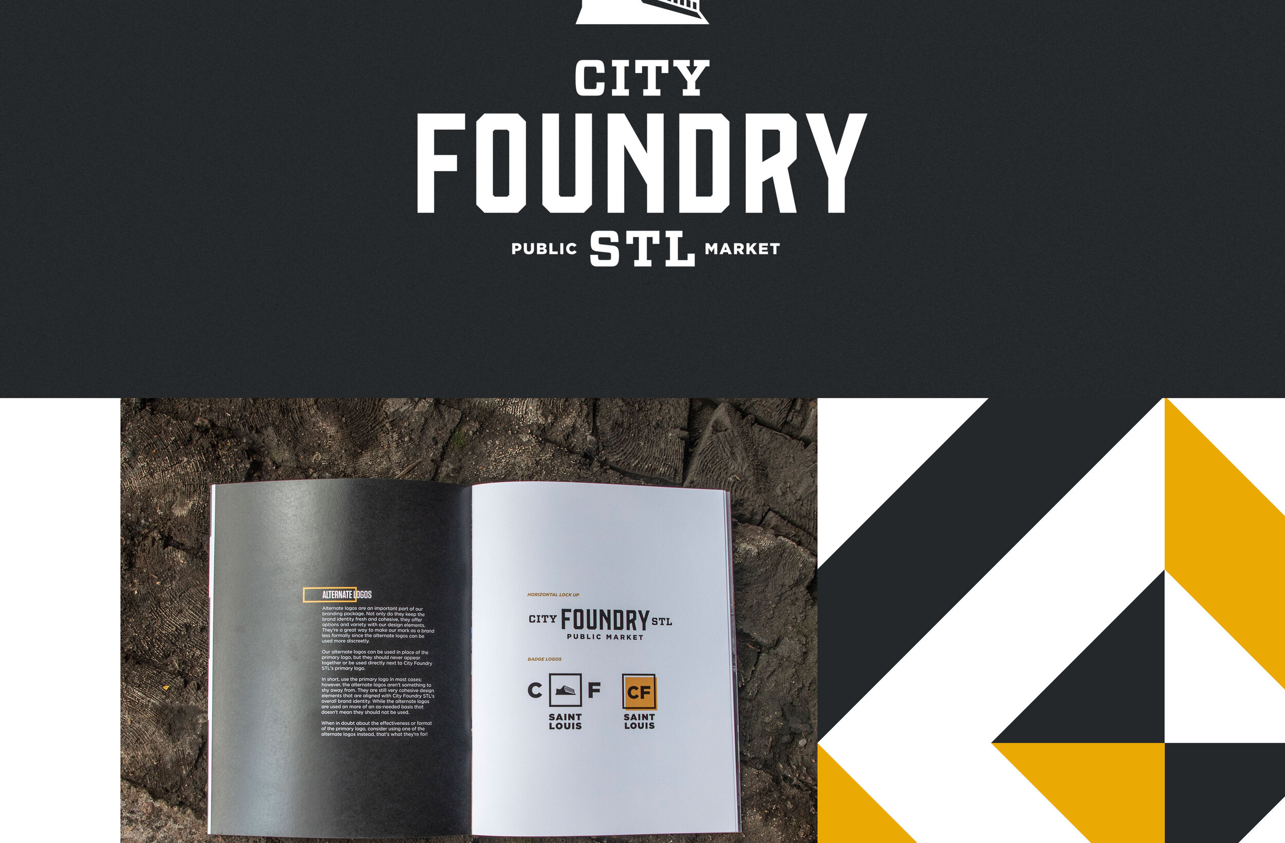
The City Foundry STL logo celebrates the unique industrial architecture of the historic foundry building. The roof line and geometric window pattern of the structure are the most recognizable and impressive features of the building. Directly below the roof is CFSTL’s most novel tenant, St. Louis’ first true food hall. Given the uniqueness of the roof and the venue beneath it, the mark connects people to the food hall and ties the physical building to the brand visuals.
Inspiration for additional visual assets were also taken from the historic foundry building. As I walked through the foundry during an early visit, I noticed lots of “safety yellow”. The color appeared almost everywhere. The building was telling me what the primary brand color should be. While “safety yellow” is a great color to communicate “caution”, I decided on a warmer yellow that was a bit easier on the eyes and a charcoal black to be the foundational colors of the CFSTL brand.
As I walked the space, yellow and black “caution stripes” painted on various surfaces caught my attention. Inspired by these stripes and the cross bracing of the industrial architecture in the space, I incorporated geometric patterns and lines into the brand’s visual language for a bold, modern punch.


Making a space a place.
Signage and environmental graphics play an important role in place-making for City Foundry STL. The signage and environmental graphics I developed for the site grab attention, create a sense of place, provide wayfinding and express the CFSTL brand in the built environment. My scope of work included developing signage guidelines for tenants in partnership with team architects, mapping out signage locations and providing brand, design and project management leadership for the project. During early phases of the project, I also developed marketing materials and renderings used to market the property to potential tenants.


